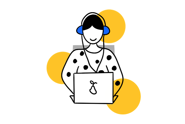
We are accustomed to ordering a taxi, watching our favourite shows and making deals with only a smartphone in our hands. In 2020, this is just a routine for many of us. However, these activities are still difficult for a large number of users with disabilities. Some of them can’t remove ad banners, and others can’t distinguish colours on a website chart due to their colour blindness. Some can’t perceive web content at all because the screen reader doesn’t work properly. To make a long story short, a lot of people can’t use inaccessible apps.
If you have just come to know about accessibility, you probably have plenty of questions:
What is accessibility? How do people with disabilities interact with the web? Do they use special applications? Can they perceive the same content as we do? Who cares about them? Who is responsible for ensuring they can fully perceive the content? How can I make content available to them? Is this a complicated process?
The article below shows how to apply the principles of accessibility during application development. The main tasks are to clearly understand the basics, set the right goals and implement them according to the designated standards.
What is web accessibility?
The term ‘accessibility’ is a sub-concept of the more general and well-known term ‘usability’.
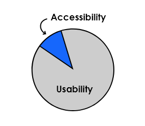
Usability is the degree to which a software system can be used by specified consumers to achieve the quantified objectives with effectiveness, efficiency and satisfaction in a quantified context of use.
Accessibility provides equal access to web content for all users, including those with disabilities.
Thus, the implementation of accessibility increases product usability. Achieving 100% accessibility means that the full functionality of the product can be accessed by absolutely any user, including those with any limited opportunities
It is important to understand that ‘limited opportunities’ arise both in the case of chronic health problems and in the case of temporary life circumstances. According to UN statistics, approximately 15% of the world’s population have some form of disability, which means that they may have difficulties while using applications.
Let’s consider the types of limitations in more detail.
‘Limited opportunities’
The main types of chronic health problems relevant to web accessibility are associated with:
![]() Hearing: total / partial deafness.
Hearing: total / partial deafness.
![]() Vision: total / partial blindness; colour blindness.
Vision: total / partial blindness; colour blindness.
![]() Musculoskeletal system: various types of paralysis; tremors; lack of limbs.
Musculoskeletal system: various types of paralysis; tremors; lack of limbs.
![]() Mental development: issues associated with the perception of information / remembering.
Mental development: issues associated with the perception of information / remembering.
In addition to permanent health problems, obstacles encountered when using applications can be temporary and situational. Let’s look at some examples of a person having to use a web product with only one hand, but for different reasons:
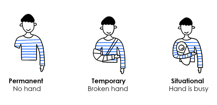
A weak Internet connection, a low-contrast projector screen demonstration or a lost mouse (which means that one must interact with the interface using the keyboard) are situational obstacles in terms of web accessibility. One of the important tasks of IT specialists is to level off the influence of barriers for all users.
Each of us will likely face some limitations in the future. In old age, motor skills, vision and hearing are weakened, while the level of automation and functionality of applications are growing every year. Thus, we must take care of ourselves in the future by making apps accessible now.
At this point, the following question may arise: Do users with disabilities use special applications? The answer is no. Most often they use the same applications as everybody else. However, this is possible only if the applications are adapted for them. One of the important components of adaptability is compatibility with assistive technologies, which will be mentioned later in this article.
Who should implement accessibility, and why should it be implemented?
There is no ‘accessibility master’ who can make your application accessible on his/her own. The adaptation of an application requires the involvement of the whole team, including:
- UX / UI Designers: design an interface following accessibility guidelines.
- Developers: provide the correct layout of the pages and make sure that all elements have the necessary tags and attributes.
- QA Engineers: perform accessibility tests.
Key reasons for implementing accessibility:
- Empathy: we can minimise the obstacles that arise between users and content, thereby making their lives better.
If you are not so sensitive or receptive, there are other reasonable motivations:
- Competitive advantage: increasing product CSI (customer satisfaction index).
More than 15% of users have permanent, temporary or situational obstacles when interacting with web content. No matter what your company is focused on—whether it be sites, mobile or desktop applications or other services—you can increase the number of users who can successfully interact with your resource by implementing accessibility.
Moreover, accessibility is a modern trend in the IT industry, the use of which improves the image of your company. - Law: a prerequisite for developing a wide range of IT projects.
Accessibility standards are also enshrined in law in most EU countries and the UK, USA, Canada, Australia, Brazil and India.
How can we make applications accessible?
Most of the work has already been done for us. There are several standards with guidelines, and if they are followed, you can make any content accessible:
- WCAG (Web Content Accessibility Guidelines) by the W3C Group
https://www.w3.org/WAI/standards-guidelines/wcag/ - Section 508 (valid in the USA)
https://www.access-board.gov/guidelines-and-standards/communications-and-it/about-the-ict-refresh
We will focus on WCAG in this article (Section 508 and WCAG are very similar and overlap in many ways, but if you are interested, you can read about the differences here). WCAG consists of four main principles or standards:
- Perceivable
- Operable
- Understandable
- Robust
Each principle includes a set of guidelines divided by levels of compliance:
A—minimal level of accessibility
AA—recommended level of accessibility
AAA—maximum level of accessibility (for specific cases)
Thus, if you want to implement accessibility, your team needs to study standards with guidelines, choose the appropriate level of accessibility and consider these requirements during the development process.
Illustrative examples of guideline application and more details on assistive technologies are given below.
Main guidelines (А/АА) and assistive technologies
Assistive technologies act as a ‘bridge’ between people with disabilities and content, and this is why a part of all guidelines is devoted to application compatibility with assistive technologies. The main types of assistive technologies are the following:
- Screen readers: allow you to interpret events that occur on the screen in a user-friendly format. For example, a smartphone reproduces information in audio format (which is necessary for blind users) or displays it on a tactile Braille keyboard (for the blind and deaf).
- Magnifiers: allow you to increase content on the screen (for visually impaired users).
- Alternative keyboards: are mostly designed for people with musculoskeletal disorders and allow them to effectively interact with digital environment even if there is no possibility to use standard keyboards.
- Speech recognition: allows apps to perform actions on a user command.
Let’s move on to the main guidelines:
1. Keyboard access
This particular guideline is significant for users with visual impairment and/or musculoskeletal disorders. Such users do not have the ability to use a mouse when working with computers; instead, they must use a keyboard, and often one single Tab key.
The four following rules are important for these users:
- Accessible content: all content must be accessible from the keyboard. If the requirement is not fulfilled, the user will not physically be able to get to the ‘Contact us’ field on your site or finish placing an order.
- Inadmissibility of traps: if keyboard access has not been tested, vicious circles may occur. When a user presses Tab, he/she might get stuck between a limited set of information blocks or elements, and may be unable to move forward or go back.
- Focus on the current block: users with a violation of the musculoskeletal system and/or limited vision should understand what element they are on right now.
- The sequence of information: users must receive information in a logical and understandable sequence while working with content from the keyboard.
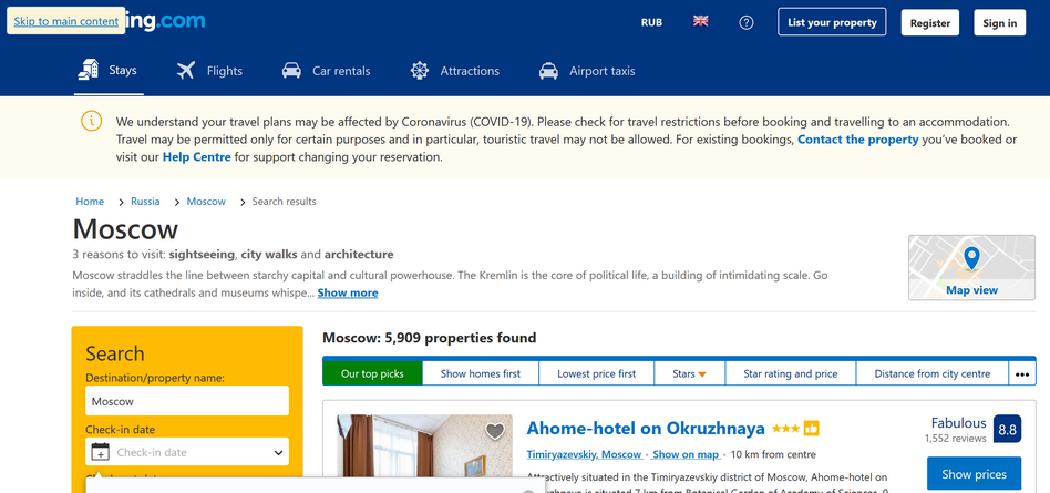
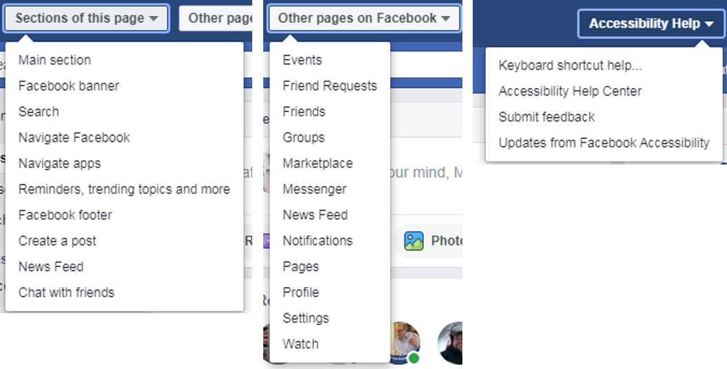
For example, Booking.com has specifically introduced a ‘Skip to main content’ link on its website for keyboard users. This allows you to get the result quickly and efficiently on request, without resorting to tabulation through all levels of navigation and additional information blocks.
Facebook has moved even further in this respect; as soon as you press Tab or Alt, a special menu with three drop-down lists appears. Unfortunately, at the moment, this function is not available in the new test version of the service.
On Facebook, a special menu helps users to quickly navigate inside a particular page, move to other sections and turn to support with a review or a question. The simplified menu gives users the opportunity to effectively interact with the fairly extensive functionality of the social network.
2. Elements’ names
When a user interacts with your app via a screen reader and keyboard access, his/her device speaks the names of the content elements.
It is critically important for users with limitations to understand the type of current screen element (e.g., text, button, picture or video). A user can take actions efficiently only if all content elements have clear and understandable names.
A case in point is the above story from Israel. Developers of large companies and users with disabilities discussed existing problems of accessible content at a special conference in 2015. It was revealed that the GetTaxi application was completely inaccessible to blind users; when the application was opened, a marketing banner appeared without an assigned name. Despite compliance with the standards of content within the application, blind users did not have the opportunity to call a taxi because they did not hear feedback from the application.
3. Colour
A significant part of the world’s population has colour perception problems. For example, it is estimated that 7–10% of men suffer from a certain degree of colour blindness.
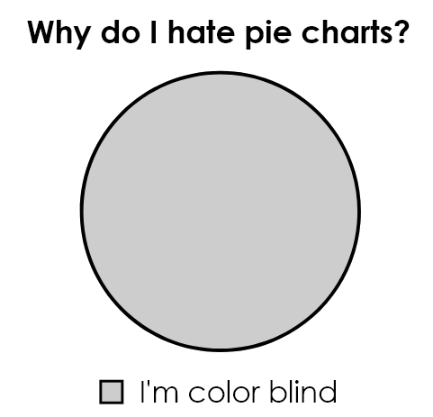
Nevertheless, we can make the content accessible regardless of a possible colour imbalance by following some simple rules.
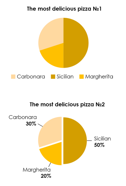
The first rule is that you should not present important information exclusively with the help of colour; additional markers should be used. For instance, it is easier to read information from the second pie chart picture below, where the graph’s meaning is clarified with the addition of information:
Another example is the Trello Task Tracker: if a user reports colour blindness, a texture is added to the colour tags. This greatly facilitates perception if you cannot distinguish between red and green colours.

The second rule concerns the contrast of images. The picture on the left below shows the visualisation of an American football league game through the eyes of one who is colour blind.
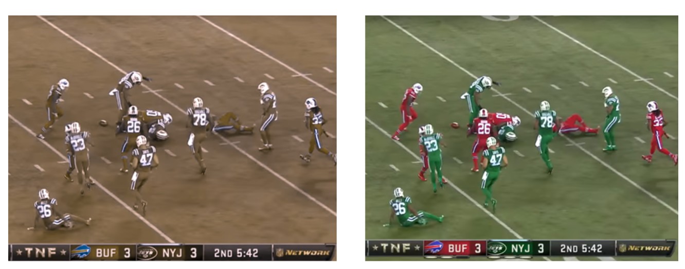
Neither texture nor additional text will help users with colour blindness to perceive such content. WCAG guidelines show us how to help users with colour blindness interact with content effectively. The solution is to use the minimum recommended contrast ratio between adjacent colours on the screen.
Here you can see how a person with colour blindness perceives content.
Here you can choose the contrasting colour combinations according to the WCAG recommendations .
4. Flash
Even a slight flash in the corner of the screen can make all page content inaccessible to a susceptible user. Any flickering, flashing and blinking should be avoided. Flashing may cause visual problems with the red spectrum.
5. The method of human communication, either spoken or written, must consist of the use of words in a structured and conventional way
What do you think of the meaning behind such a long heading?
You might be surprised, but this is a formal definition of the simple word ‘language’. The informational text in your product should be short, clear and informative. Accessibility of information in terms of presentation greatly facilitates the perception of content.
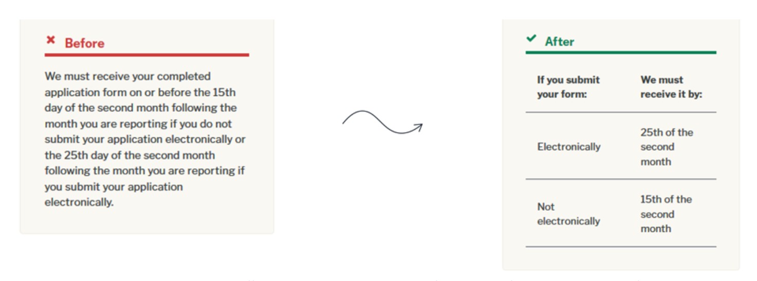
Source: https://www.plainlanguage.gov/examples/before-and-after/
It is worth noting that there is a Plain Language movement in the US, which is engaged in testing the conciseness and richness of texts. The developed metrics allow us to evaluate the complexity of perception for users.
Testing existing and new products
You can develop new products with an appropriate level of accessibility using assistive technology and by following standards. This does not require significant financial investments, and additional development time is limited to choosing a specific level of accessibility and getting acquainted with the relevant guidelines.
What if you are just now learning about accessibility, and the product was released long ago or is already in the process of development? You are urged to keep two simple rules in mind:
- The sooner you start implementing accessibility, the less time you will have to spend on making changes in your project.
- Minimum accessibility is better than nothing.
How can you test for accessibility?
Screen readers
Try to perceive the content of the application or site without the help of a mouse, focusing only on listening with your eyes closed. You might learn a lot about your product this way!
Here is the most common (and free) screen reader for desktops:
![]() NVDA
NVDA
You do not need to download additional testing applications on your smartphone due to built-in screen readers. A special set of gestures (swipe and tap) is used instead of keyboard access for these applications.
![]() Voice Over
Voice Over
 Talkback
Automated accessibility reports
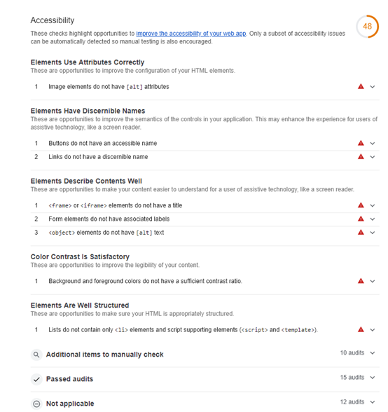
Browser extensions help you when testing the product for compliance with the rest of the guidelines. For instance, Google Chrome has built-in auditing:
![]() Lighthouse (Google Chrome)
Lighthouse (Google Chrome)
The accessibility report includes errors that were found using the algorithm, as well as guidelines that need to be checked manually (e.g., clarity of the text).
You can use the developer panel for a basic test in Firefox or download the following add-on for a full report:
![]() Wave
Wave
The accessibility report in the mobile application can be obtained through the following application
![]() a11y Tools (this application is not free)
a11y Tools (this application is not free)
P.S ![]() is the generally accepted accessibility icon, and a11y is an abbreviation. Guess why this is the abbreviation?
is the generally accepted accessibility icon, and a11y is an abbreviation. Guess why this is the abbreviation?
There are 11 letters between a and y.
It is important to understand that automatic testing must be combined with manual testing. The best idea is to bring in people with disabilities to help with testing.
Conclusion
The main thing to remember is that accessibility is not only about people with disabilities; it is about each one of us.
The IT community can help a huge number of users by providing them with equivalent access to the functionality of modern applications and services. The solution is only a matter of paying attention to simple rules when developing a product.