UX Audit for a Country Risk Platform
Our client is one of Europe's largest business-to-business financial information providers that publishes content on markets, banking, fintech, and other financial sectors. Their sub-brand represents an online platform that captures and aggregates the views of country risk experts. At its core, the online tool provides access to a transparent and independent opinion-based country risk rating.
The client wanted to improve the user experience on their online platform. Together, we defined the core KPIs for the product update:
- Modernising the app and making it more competitive.
- Getting rid of overcomplicated functionality and information.
- Visualising important information in a readable way.
- Bringing new traffic and subscribers from the main product (a platform with information on financial markets).
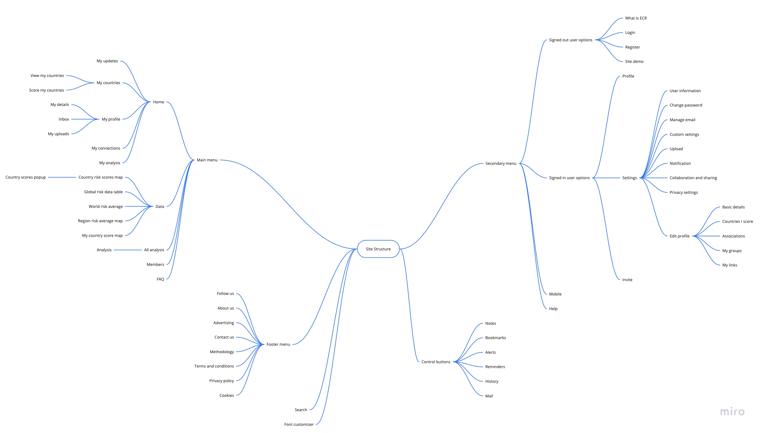
First, we began by studying the product and subject area, business processes, and GA indicators. We researched the existing website and highlighted all the entities in its information structure. As a result, we were able to create a structured mental map, shown in the picture below. Having this visualisation in front us allowed us to easily detect duplicate links and redundant navigation elements.
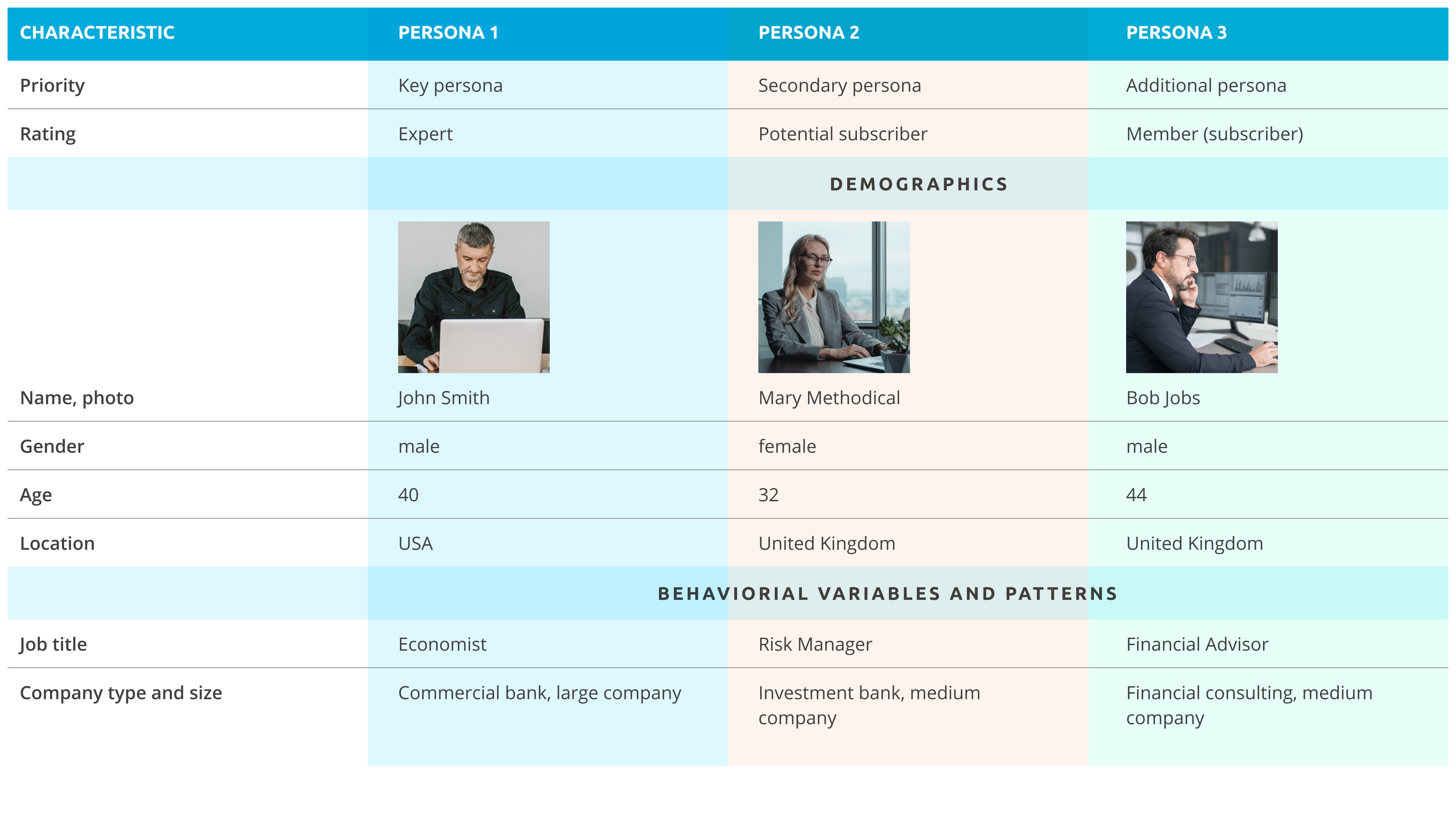
Next, we analysed advanced market segments based on Google Analytics data. This information allowed us to create several user personas. Based on these personas, we were able to identify the main scenarios that the users performed on the website, such as the following:
- search for analysis
- search for survey data
- registration
- assessment by country
- uploading documents
- communication with other users.
After analysing these scenarios, we realised where the problem areas were:
- non-compliance with Fitts’s law
- disregard for different types of users
- no tooltips or interface guidance.
All this information helped us to build a few basic hypotheses. To verify their validity, we chose to conduct in-depth interviews. We found respondents who matched our personas, with whom we successfully conducted problematic interviews. Through this process, we obtained a full view of the problem areas and convinced the business that the product needed to be relaunched.
As a part of the auditing process, our team presented a new design concept that solved the business requirements of the project with which the client was concerned. Specifically, the new website brought a new type of traffic and subscribers, maintained the existing users, and became a more competitive product on the market.
In overseeing UX research, we identified difficulties that users faced during completing their key tasks, conducted in-depth interviews to test our hypotheses, and created mockups for the new website. The updated website allowed the users to obtain all the information they needed within a couple of clicks and drastically simplified their work routines. The client acknowledged the team's well-coordinated work and noticed an improvement in conversions, so the company was able to secure more customers through the traffic they already had.
Related Cases
Read allISD Drug Discovery
Development of a state-of-the-art AI-powered platform combining active learning, automation, and secure collaboration.
GMS Co-Create Integration
Integration of an AI/LLM-powered assistant for medical workers supporting Deviation Memo (DM) management.
RTSM Solution: Data Ingestion Improvement
Removing issues in data architecture and processing in order to provide a solid foundation for future growth of the platform.