Who does this article target?
This information will come in handy if you are in charge of designing new components, test interfaces, work with a front end engineer, or are such an engineer yourself but are not very much knowledgeable about accessibility.
I will cover some basic accessibility guides and the key points to pay attention to: focus order, keyboard interaction, and ARIA attributes. I am also going to show how documentation may assist in developing accessible components, i.e. components that meet accessibility requirements.
Note: By accessibility, I mean meeting accessibility requirements for people with disabilities; for further details, please read more in our article about accessibility. Also, a kind reminder: good design does not only mean fancy design, it should also be user friendly, and accessibility is part of usability.
Remember accessibility when developing a component
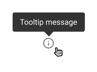
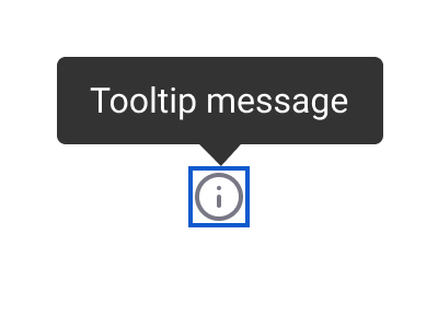
Let's assume you need to design a tooltip that shows up when you hover over an information icon. This means you should provide equal access to such information for each of your users, regardless of their disabilities. Then, you may want to stick to the following approach.
Imagine your user is working with:
- only a keyboard
- only a mouse or another similar pointing device
- screen magnifier
- screen reader.
All this has already been taking into account by those who developed the Web Content Accessibility Guidelines (WCAG) by W3C, which are currently running Version 2.1. The Guidelines do not only list the basic principles, but also cover the details: why each principle is important, how it helps people with a particular health condition, and how to ensure that it is implemented in practice.
Note: In some countries, WCAG compliance is legally binding. If you are developing a website or an app that will be used in the US, you will have to comply with Section 508 instead. These two standards are quite similar, but there are still some differences, which are listed and detailed here.
Using a mouse
If your user is working with a mouse, they can hover over the icon and see the tip, i.e. there is no problem here. Just remember that the icon size must be at least 24x24 pixels for mouse users, and 44–48 pixels for touchscreen users.
Using a keyboard
When a user works with a website using a keyboard only, they may already encounter issues, as they have nothing to hover over the icon with. For such a user, you must provide an option to activate the tip with a keyboard, namely, by going to the icon with the Tab key and seeing the tip. For this to happen, you must include your icon into the Focus Order. The user must also have an option to close the tooltip with the Esc key.
Using screen magnifier
For screen magnifier users, you should particularly stick to the principles outlined in Section 1.4.13: Content on Hover or Focus of the WCAG. Basically, the content that shows up when hovering over an element or focusing it must be:
- Dismissible: the user may dismiss the content without moving the focus or cursor., e.g., with the Esc key.
- Hoverable: the user may move the cursor from the button to the content showing up (in our case, to the tip), without the content disappearing. When the screen is significantly zoomed in, it is highly likely that, at a certain point in time, the user will be seeing only a part of the content, e.g., a trigger button and the beginning of the tooltip. To view the entire tip, the user must have an option to move the cursor away from the button and place it to the pop-up window without closing the tooltip.
- Persistent: any additional content that shows up must remain visible until the focus or cursor is moved away from the button or such additional content, or until the user dismisses the content with the Esc key.
 Failing to meet the ‘hoverable’ criterion: in this example, the user cannot move the cursor from the trigger to the tooltip.
 When the screen is largely zoomed in, a part of the tip may remain invisible. The Hoverable principle says the user must have an option to view the entire tip when the cursor is moved to it.
Using screen reader
As for those who use screen readers, you already have your icon included into the focus order, which means that visually challenged people are able to navigate to it using their keyboard. This requires reading the tip aloud, and here is when the ARIA attributes, in our case, aria-describedby, come into play. (We will cover ARIA attributes more in detail below.) After adding this label to the icon's HTML attributes, the tooltip content will become 'visible', or audible, to be more precise, to the screen reader users. When the element gets in focus, it will read out something like: Information Icon, <Tooltip Text>.
Thus, each of your users will surely see or hear the tooltip text, which means your task has been successfully completed.
ARIA attributes
The WAI-ARIA standard is a tool that makes web content accessible. Also developed by W3C, it is currently running Version 1.1. While the WCAG describe the basic principles for website and application accessibility, WAI-ARIA comes into play when you want to add more functionality, such as dynamic content or custom controls.
Technically, screen readers and other assisting technologies are able to interact, by default, only with regular HTML elements, such as buttons, input fields, headers, etc. This means that some of the advanced features and custom components of your website may simply become inaccessible to those who are not using any mouse or are running a screen reader. Such cases make the ARIA attributes indispensable. A designer does not need to know them all; however, understanding how they work is of great helpful. Below, we will further explain this topic based on a few examples.
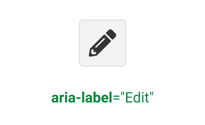
Aria-label: helps to assign a title to a component that will be visible exclusively to screen readers.
For instance, let's assume your UI has an edit button with a pencil icon, as it looks nice and doesn't take up much space, while a pencil image is usually associated with the editing action.
For a sighted user, this should be pretty much understandable; for a screen reader user, however, one has to add an explanatory label that would be hidden from view but not from screen readers. To do this, you can just use the aria-label = "Edit" property; when the focus is on the button, it will be read out as Edit button.
You can use this attribute when you do not want to overload the UI with visual content, but need at the same time to provide clarity for people with disabilities.
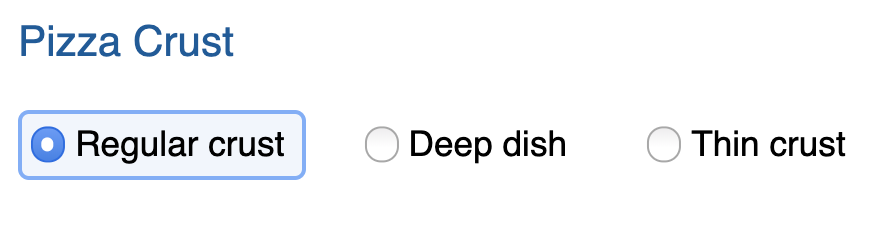
Aria-labelledby: allows you to refer to another visible heading or title, e.g., if you have a group of radio buttons with a common title.
Aria-describedby: provides additional information to an existing visible title, e.g., when you have an input field named Password and a text describing how long the password may be and what it can contain.
 Example of using the aria-describedby property. Web Accessibility course powered by Google, Lesson 5. To view the course, please sign up to Udacity (no credit card details needed).
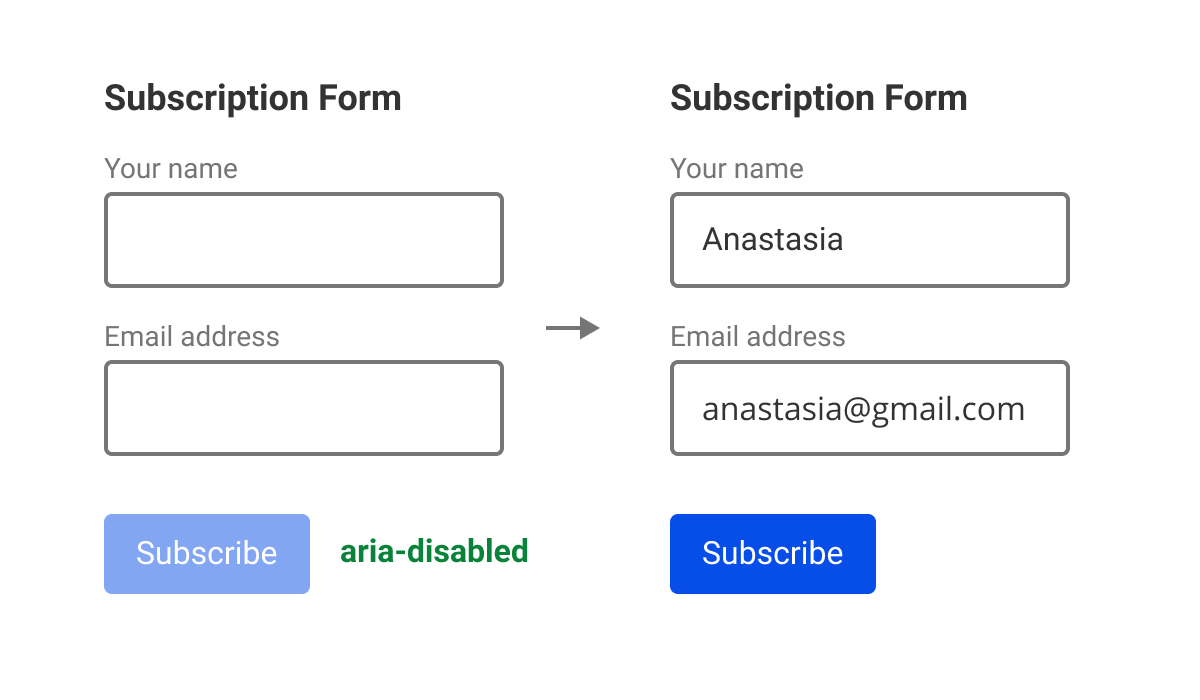
Aria-disabled: Allows you to include an inactive (disabled) component in the focus order. Normally, when you hit the Tab key, the inactive component will be skipped, which means this component will kind of not exist for screen reader users. This is generally correct; in some cases, however, you may want the disabled person to 'see' this element as well.
Let's assume you have a feedback form with a Submit button. By default, the button is inactive, but will become available once all fields get filled out; a fairly common and familiar pattern. Although the button is semi-transparent, it is still there, while it becomes fully visible and active when all fields are filled. In this case, the screen reader user will also need to know that there is initially a button in the form, albeit inactive, which will help them understand that they need to fill out all fields to activate it.
To view all ARIA attributes, see the full list at W3.org.
Focus order
To make the life easier for people using only a keyboard, you need to know the basic requirements for focus behaviour:
- only interactive elements, i.e. buttons, links, check boxes, etc., may be in focus; screen readers have other tools to navigate through text, titles, and tables.
- the focus order must match the visual or logical order of the interactive elements.
- no inactive controls may get in focus.
- The Tab key moves focus to the next component, while Shift+Tab brings you to the previous one. Arrow keys are used to move focus within components (see the details in the next section).
The example below shows the focus follow rules violated, as a non-interactive element, namely the text of an agreement being accepted with a checkbox, is in focus. To help the user read the text associated with the I accept these terms checkbox, you can use the aria-describedby property we already mentioned.
 The agreement text should not be included into the focus order; instead, one should use the aria-describedby property.
Note: This principle can simplify matters even for those who do not have any disabilities, either permanent or temporary, as some people just prefer to work with forms using a keyboard only.
Keyboard interaction
When a user works with the UI, they expect objects to respond in a certain way to certain keystrokes. For instance, most are used to the fact that you can tick or untick a checkbox with a space, open a dropdown list with Alt + Down Arrow, etc. When a control does not respond to the keyboard in the way we expect, it is easy to see it and solve the problem using a mouse or touchscreen. When a user cannot see the interface element or click it, however, we've got an issue.
This is where another guide by W3C, WAI-ARIA Authoring Practices comes in handy. Its purpose is to show you how to use WAI-ARIA when developing accessible components. The Design Patterns and Widgets section describes the keyboard interaction and the roles and ARIA attributes that are useful when creating such interaction.
For example, for a radio button group, we've got the following rules:
- Tab or Tab+Shift brings focus to the radio button group.
- The spacebar key selects a radio button, if not already selected.
- The right and down arrow keys move the focus from one radio button to another within a group, deselecting the previous one and selecting the current button, etc.
Make sure to check this guide regularly and bookmark useful pages.
Using documentation
Last but not least, let us see how one can use the accessibility documentation based on an example of developing a modal dialogue. Let's assume an error message shows up on the screen. A sighted user will instantly notice it; a visually challenged one, however, will not, so you need to notify them on it in another way.
As mentioned above, the WAI-ARIA standard and the WAI-ARIA manual state how all major components should behave. In our case, you need to use the alertdialog (Alert and Message Dialogues) role, aka error dialogue or message box.
Now it is time to talk about one of the key concepts of WAI-ARIA, the roles.
A role, determined by the role aria attribute, is a specific pattern of user interaction with the UI. The standard has an exhaustive list of roles one may assign to the controls. In particular, one may make a div behave like a checkbox, in which case the screen reader will not only read the text from this block aloud, but will also inform whether the checkbox is ticked, and play the appropriate sound. For a visually challenged user, such sound will be the same signal as a checkbox for a sighted one. Thus, the user will understand that they can interact with this element by ticking or unticking the box by hitting the spacebar key.
You should bear in mind that, when assigning a certain role to a control element, you kind of commit to equipping this element with at least the essential ARIA attributes the screen readers need to read it out aloud correctly. Thus, for a checkbox, you need to specify not only its name, but also its state, checked or unchecked. As the WAI-ARIA Authoring Practices say, ‘No ARIA is better, than bad ARIA’.
Now let us get back to our dialogue. The alertdialog role allows the assisting technologies and the browser to recognize the alert or error message dialogue and make it show up in a special way, such as by playing a system alert sound.
From the explanations for the alertdialog role in the WAI-ARIA Roles, States, and Properties section, you will learn that, for an element with the alertdialog role, you must specify the value of one of the following attributes (see above for details on those):
- aria-labelledby: refers to the visible element containing the dialogue title, or
- aria-label: when there is no visible title and you only need to specify it for the screen reader.
In addition, you must provide a value for the aria-describedby attribute in case there is any description text in the dialogue. As mentioned above, the aria-labelledby attribute means that the element does have a title. In our case, it is a dialog that refers to its own name and, when opened, sounds like: Dialog,<Dialog Title> (e.g. Confirm Delete), <Dialog Text> (e.g. Are you sure you want to delete this? This action cannot be undone). Thus, a visually challenged user will get a clear idea of what kind of dialog has showed up on the screen.
Next, WAI-ARIA says that alertdialog is a subclass of modal dialog (dialog role), which means you must meet the requirements for this role. Here is, briefly, what you will get from the modal dialog guide:
- The focus moves to the first active element in the dialog.
- Once the dialog is closed, the focus moves to the previous element, unless the logic requires it to be placed to the next element after the previous one.
- The content on the dialog's background is grayed out and inactive.
If you do not meet these requirements, your user will not be able to interact with the dialog content.
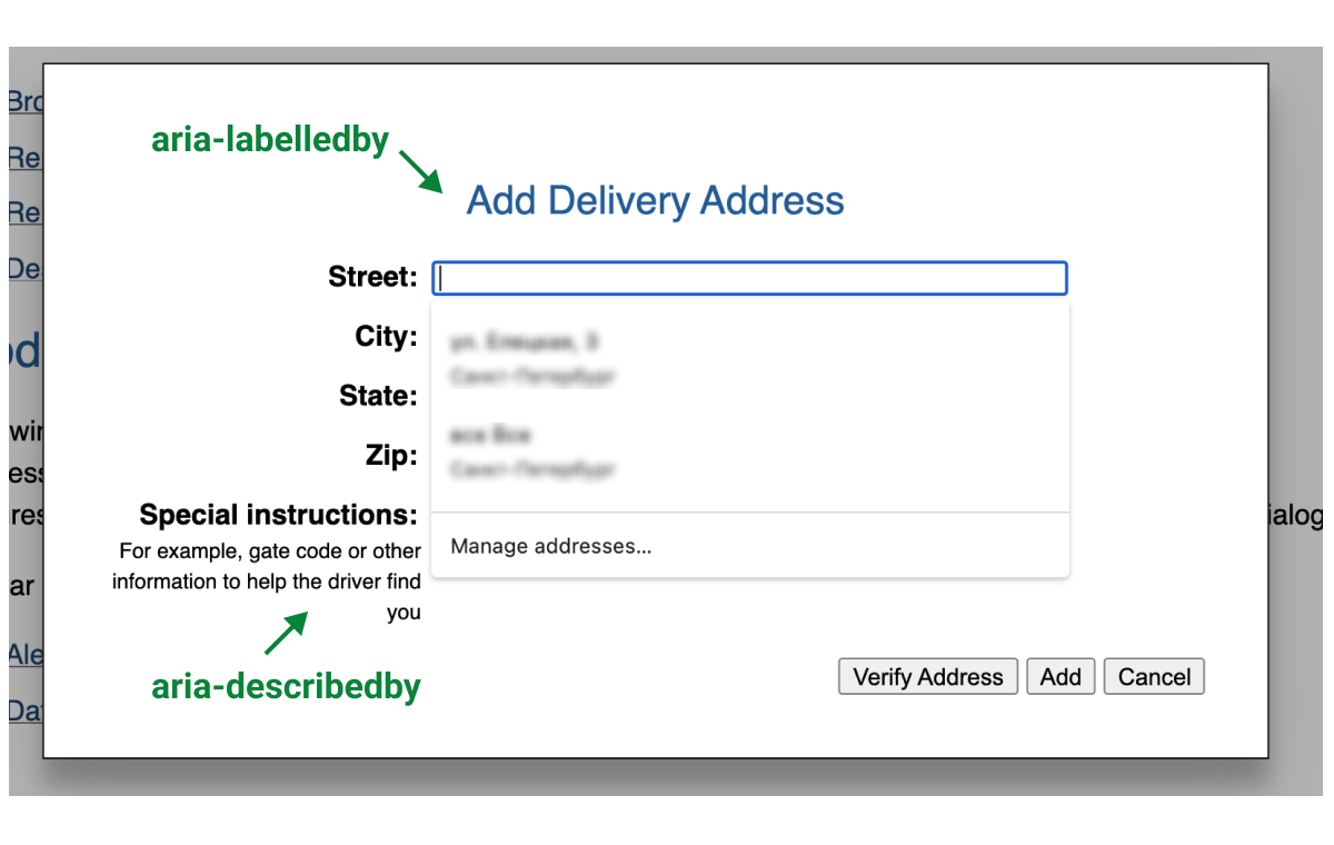
When the dialog shows up, its title is read out aloud based on the aria-labelledby attribute, and the focus moves to the first interactive element, which is the text box. When the focus moves to the Special instructions field, the aria-describedby property will make the screen reader read the description out aloud, too.
Thus, one does not need to reinvent the wheel here, as all important points have already been included into the documentation.
Note: WAI-ARIA does not only detail each particular role, it also helps you select the one that best suits your needs. In particular, you will learn that the alertdialog role should be distinguished from the alert role, which is a live region (a kind of dynamic content) that contains important and / or urgent information you need to supply to the user without having focus on it. WAI-ARIA defines live regions as web page areas that change as a result of external events, while the user focus is somewhere else on the same page. A chat window, a currency rate widget, or a timer are all examples of live regions. Previously, such areas were invisible to assistant technologies, but now they may get processed using the aria-live, aria-relevant, aria-atomic, and aria-busy attributes.
Testing
After you get basically familiar with the ARIA attributes, focus behavior rules, and keyboard interaction rules, you can try testing your UI yourself.
- Make sure that all interactive elements have focus, while the focus is visually distinguishable and matches the order of the elements on the screen.
- Test keyboard interaction with each of the interactive elements: dropdown lists must show up after pressing Alt + Down Arrow, list items and radio buttons must be selectable with the arrow keys, buttons must get clicked when you hit Enter, checkboxes must get ticked and unticked with Spacebar, tooltips must get dismissed when you hit Esc, etc.
- Install Screen Reader от Google, a free Chrome extension that will help you check whether your UI elements are voiced correctly.
Conclusion
You may now ask how this helps me in my daily work. Well, performing independent studies on accessibility requirements and sticking to clear rules for the component behaviour saves time to any developer involved in the front end part of the product.
You can put down the requirements into a separate document; for me, however, it is more convenient to make notes directly in the Figma file putting the list of compliance parameters next to the component design.
Finally, a kind reminder again: accessible design will improve the usability not only for people with permanent disabilities, but also for regular users. All users will benefit in case:
- all interactive elements are accessible from keyboard, and
- everything is clearly and logically labeled with text.
For this, aim at using regular HTML/CSS, general UX standards, and common sense, and make sure to stick to:
- The WCAG, which describes the accessibility principles
- The WAI-ARIA standard, with which you do not have to choose between your website's or application's accessibility for screen readers and creating complex and dynamic design, as you can implement both at the same time
- The WAI-ARIA Authoring Practices, which describes in detail how to make a particular control accessible.
Note: You can also take a free course by Google on Udacity if you would like to dive into the topic a little more.